Pain
Energy can overpower shopping
Campaigns, visual branding, and new products can crowd the interface until visitors cannot tell where to browse or what to do next.
Live client website
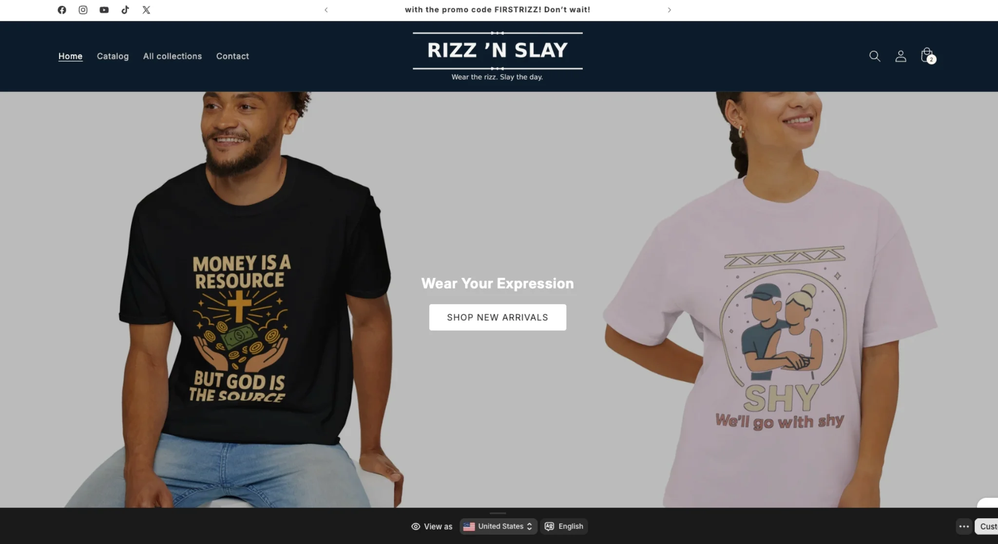
An online store can have strong products and still make shopping feel difficult. Promotion space, categories, product discovery, brand personality, and checkout all compete for attention. Rizz 'N Slay needed those pieces to feel energetic without hiding the path to purchase.
Pain
Campaigns, visual branding, and new products can crowd the interface until visitors cannot tell where to browse or what to do next.
Fix
Promotions create interest, navigation organizes the catalog, and product paths keep the buying action within reach.
Result
The brand can stay expressive while the customer journey remains readable on desktop and mobile.
The website problem
A shopper may arrive because of one promotion but still want to explore the rest of the store. If the campaign takes over the interface, the catalog disappears. If the catalog feels generic, the brand loses the personality that earned the click. The stronger structure lets promotion and product discovery support each other.
This ecommerce website case study focuses on that hierarchy. The finished experience gives the brand room to speak, makes the store categories understandable, and keeps the route toward a product and checkout easy to follow.
What Sowynet built
Live commerce proof
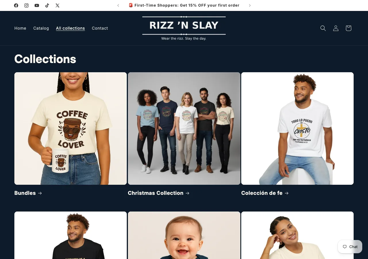
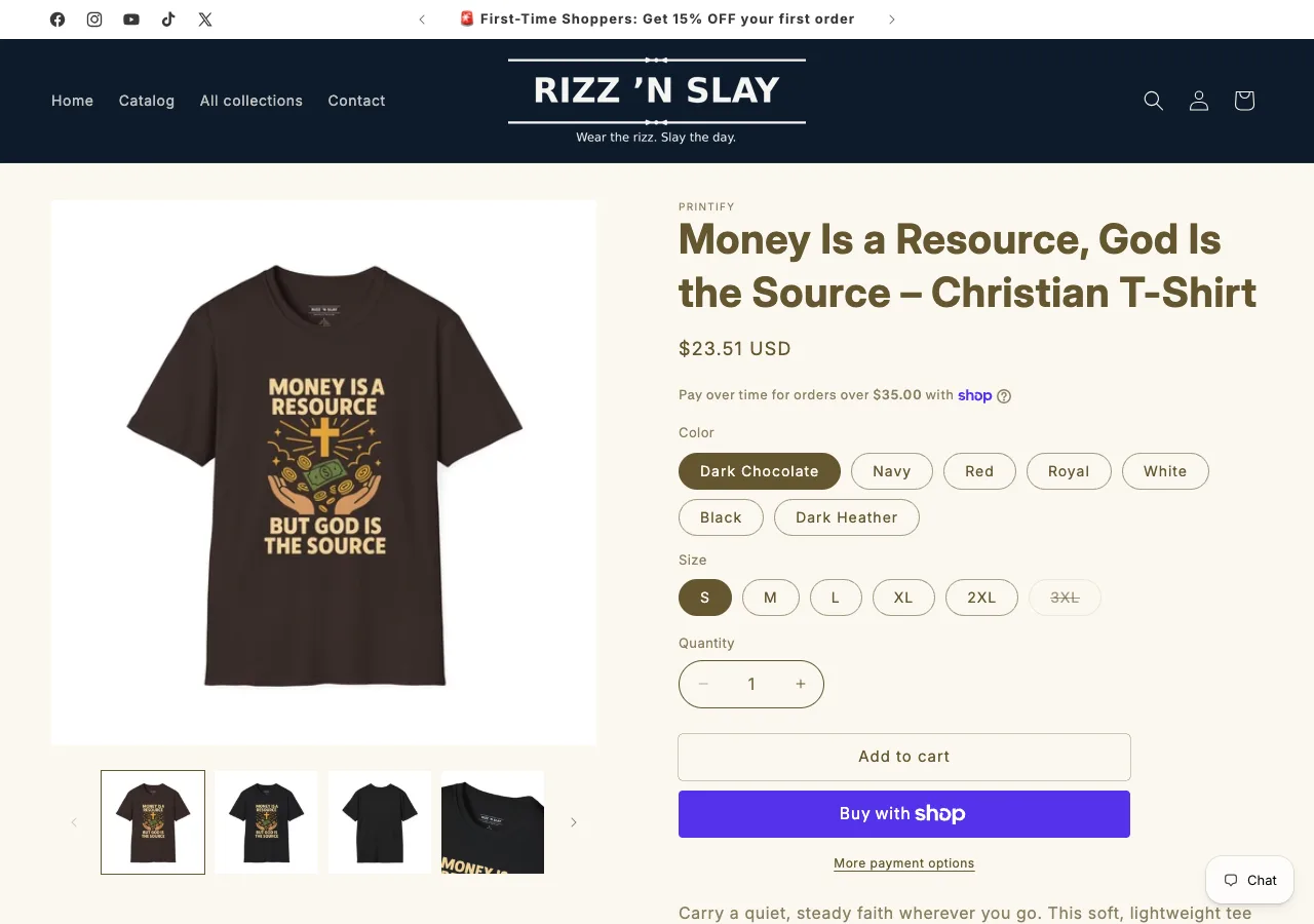
The storefront separates browsing from buying without breaking the brand. Shoppers can move from a visual collection to product imagery, variants, quantity, cart, and checkout.
Inspectable outcome
The public proof is the live shopping structure: a visitor can recognize the brand, notice current promotional content, browse products, and move toward purchase without switching to a separate experience. These are visible design and information-architecture outcomes. We do not attach unverified sales or conversion figures to them.
Lead with brand and promotion.
Move through clear product paths.
Focus on the relevant item.
Continue to the checkout path.
Project lesson
A distinctive store does not need to become difficult. Strong ecommerce design gives campaigns, categories, products, and purchase actions an intentional order.
Connect the brand to the purchase
Book the Website Consultation service. We will review the catalog, promotion plan, mobile journey, and checkout handoff.