Web design
Responsive Web Design Tips: Why It Matters for Websites
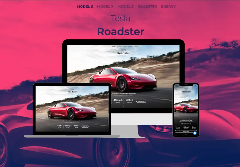
Mobile-first layouts, performant code, and accessibility guardrails keep visitors engaged from the first tap.
Key takeaways
Responsive design safeguards the experience from discovery to conversion, no matter which device visitors prefer.
- Lead with mobile intent. Plan content hierarchy and navigation around thumb-friendly gestures and small viewport priorities.
- Optimize performance early. Minify assets, lazy-load media, and monitor Core Web Vitals to stay within critical speed thresholds.
- Bake in accessibility. Contrast ratios, tap targets, and semantic markup ensure your responsive design works for every user.
Why responsive design stays essential: responsive web design
Smartphones, tablets, and laptops all vie for attention. Responsive design ensures your site adapts to each one without sacrificing clarity or conversion. It is not just a buzzword—it is the foundation of modern user experience.
Your website is often a user's first interaction with your business. A visually appealing layout that responds gracefully to any screen establishes trust and encourages people to explore further.
- Design mobile-first so key actions shine on small screens before scaling up.
- Optimize assets through compression, caching, and critical CSS to keep pages fast.
- Audit accessibility so contrast, typography, and navigation work for every visitor.
Blend aesthetics with performance
Great design is more than good looks. Responsive systems prioritize usability with clear call-to-actions, intuitive navigation, and layouts that adapt to content density. They protect your SEO efforts by delivering fast load times and balanced code.
Responsive design is also a living practice. Browser capabilities, device sizes, and user expectations shift constantly. Maintaining a cadence for audits—both manual and automated—keeps your experience future-proof.
Keep refining with data and modern tooling
Pair regular usability reviews with analytics. Monitor bounce rate, scroll depth, and conversions across devices to understand where adjustments are needed.
When updates fall outside the scope of your in-house team, modular tools like Adobe Express provide quick, on-brand assets while your core design system stays intact.

Responsive design checklist before launch
Responsive design fails when teams only look at screenshots instead of real usage. Before launch, test the layouts people actually use: phones in portrait, tablets in landscape, older browsers, slow connections, and key conversion pages with real forms and taps.
The goal is not to make every breakpoint look identical. It is to keep the most important actions readable, reachable, and fast no matter which screen a visitor uses.
That means treating responsive design as QA plus business logic, not just visual polish.
- Test navigation, forms, and CTA buttons on real mobile devices.
- Check page speed on the templates that drive the most traffic.
- Verify tap targets, spacing, and font size on smaller screens.
- Review image behavior, cropping, and layout shifts at key breakpoints.
- Confirm tables, embeds, and cards do not break narrow layouts.
- Measure conversion rate by device type after launch.
Need help? Schedule a responsive audit.

Conversion workflow for responsive websites
Responsive design matters because mobile visitors decide quickly whether the site feels trustworthy and usable. If buttons are cramped, pages jump, or forms fight the keyboard, conversion drops before the offer even has a chance.
Pair responsive improvements with clear calls to action, proof near key decision points, and a fast path to contact so better usability turns into better lead quality.
- Use a consistent primary CTA on every high-intent page.
- Add proof blocks near key decision points.
- Track form completion and call quality.
- Offer a quick audit or mobile UX review.
- Reduce fields and speed up the form experience.
- Review results monthly and iterate quickly.
Ready to improve conversion rates? Book a discovery call.

Upgrade to a fully responsive website
Work with Sowynet to audit your site, resolve breakpoints, and deliver fast-loading experiences on every device.
Schedule a responsive auditApproval checklist for responsive design updates
Before approving responsive design work, decision makers usually want clarity on device coverage, conversion impact, and whether the changes improve speed or just rearrange the layout.
- Clear scope for SEO, design, and content work.
- Timeline with milestones and check-ins.
- KPIs tied to leads and revenue.
- Proof of experience in Indiana markets.
- Reporting cadence and dashboard access.
- Plan for ongoing updates after launch.
We provide this detail during discovery so teams can approve quickly.

Implementation workflow for responsive design improvements
Our workflow keeps responsive projects organized and measurable. We align on device priorities, fix the highest-friction templates first, then launch with QA and tracking so the team can see the impact by device type.
- Device and template audit.
- Breakpoint planning and design updates.
- Performance tuning and QA testing.
- Launch with analytics by device type.
- Post-launch fixes and optimization.
If you want a roadmap, book a strategy call.
How responsive design builds trust faster
Visitors trust sites that feel stable and easy to use. Clean mobile spacing, readable type, fast image loading, and forms that work on the first try create confidence before anyone reads a case study or testimonial.
That is why responsive work often improves trust and conversion together. The site stops feeling fragile and starts feeling ready for real users.
- Use testimonials with names, roles, and outcomes.
- Show examples of before-and-after improvements.
- Offer a short assessment or audit as a CTA.
- Explain timelines and what to expect after kickoff.
- Link to service pages and supporting resources.
- Keep contact options visible throughout the page.
Need help with proof and positioning? Talk with our team.
Turning responsive design improvements into booked meetings
Great design only helps the business if the next step is obvious. Keep one primary CTA, reinforce it with proof, and make the contact flow as easy on mobile as it is on desktop.
When the CTA aligns with the usability promise of the page, visitors are more likely to stay engaged and convert.
- Use one CTA label across the page.
- Place the CTA above the fold and near FAQs.
- Add a short guarantee or risk reducer.
- Connect the CTA to a local service area.
- Include a simple booking or scheduling link.
- Confirm follow-up expectations on submission.
Need help? Talk with our team.
Polish the responsive experience before launch
A quick polish step keeps the experience fast, readable, and easy to act on. These final checks catch the issues that often survive design reviews but hurt real users.
- Check headings for clarity and keyword focus.
- Ensure proof points are near the CTA.
- Link to related blogs for depth.
- Reduce friction in the contact flow.
Need a second set of eyes? Schedule a review.
Execution framework
How to make responsive design improvements work in weekly operations
Pain: teams often know the site feels weak on mobile, but nobody owns the breakpoints, performance fixes, or form friction that actually cost conversions. Issues stay visible for months because they are treated like design polish instead of revenue risk.
Fix: treat responsive design like an operating system. Use one owner, one QA rhythm, one scorecard by device type, and one prioritized list of templates to improve.
Result: the site becomes easier to use, easier to trust, and easier to convert on the screens people use most.
- Review conversion rates by device type every week.
- Fix the highest-friction template before redesigning everything.
- Test forms, menus, and nav on real phones after each release.
- Track speed, layout shift, and CTA visibility on key pages.
- Keep one owner responsible for responsive QA and follow-through.
- Refresh weak templates first instead of rebuilding the whole site.
If you want this turned into a working improvement plan, book a strategy call and we will map the first 30 days with your team.
Frequently asked questions
Responsive design essentials in one place
These answers summarize why responsive design matters and how to validate your layouts before launch.
Why is responsive design still a priority?
More than half of site traffic comes from mobile devices. Responsive systems protect user experience, SEO rankings, and conversion rates.
How is responsive design different from adaptive design?
Responsive layouts fluidly adjust with percentage-based grids, while adaptive designs rely on fixed breakpoints with separate templates.
What tools help test responsive performance?
Combine browser dev tools, device emulators, and services like BrowserStack or WebPageTest to validate layouts and speed.
Quick summary
Responsive design fast facts
Covers why flexible layouts, accessibility, and performance-first builds still drive rankings and conversions.
- Device coverage Fluid grids, modern breakpoints, and touch-friendly UI stop mobile drop-offs.
- Performance mindset Lightweight media, caching, and Core Web Vitals guard search visibility.
- Continuous QA Real-device testing plus analytics feedback keeps layouts honest.
Use this block when planning responsive site benefits or must-have tactics.
Pain - Fix - Result Framework
From mobile friction to measurable conversion gains
Pain: visitors hit cramped layouts, slow pages, and awkward forms on mobile and leave before acting.
Fix: we align breakpoints, performance, and CTA visibility so the site stays usable across real devices.
Result: better engagement, stronger trust, and more of your mobile traffic turning into leads.
Next step
Apply this topic with a responsive improvement plan
If this article matches what you need, connect it to one clear service page and one clear conversion goal.
Start with the related service page, then align mobile UX fixes and CTA paths so readers can take action faster.
That improves usability for people and gives the site a cleaner path from traffic to inquiry.
View the related service pageRelated reading
Explore related guides and service pages
These links expand the topic and help readers compare practical next steps.
Loading related resources...
Loading recent posts...