Restaurant website support
Restaurant Online Ordering Page: Fix the Friction That Costs Orders
A restaurant online ordering page should make the next tap easy. When it feels slow, cluttered, or unclear on mobile, hungry guests leave before they ever reach checkout.
Restaurant online ordering page performance matters because guests arrive with intent. They tapped from Google, social media, or a text from a friend. They are already close to ordering. If the page slows them down, the sale leaks out in seconds.
Pain: the restaurant gets traffic, but the ordering page creates drag right before the sale. Fix: tighten mobile layout, simplify the menu path, show trust details fast, and keep the order action visible. Result: more menu visits turn into paid orders without forcing the team to buy more traffic first.
This guide stays practical. It is for owners and managers who want a stronger ordering page, not another vague marketing promise.
Key takeaways
The strongest restaurant ordering pages remove doubt fast, keep the path short, and stay aligned with the real menu, hours, and order options.
- Short path wins. Guests should reach menu categories and the order action in one or two taps.
- Trust details matter. Hours, pickup or delivery options, and accurate pricing reduce hesitation.
- Weekly upkeep protects revenue. One owner and one checklist prevent stale links and slow leaks.

Why a restaurant online ordering page loses orders before checkout
Most restaurants do not lose the order because the food looks weak. They lose it because the page makes small choices feel hard. The guest cannot tell where to start. The menu takes too long to load. The pickup details are buried. The phone number is missing when a quick question comes up.
That friction does not look dramatic in analytics. It looks like quiet drop-off. A few taps, a short pause, then the visitor is gone. Owners often blame ads, local SEO, or the delivery platform first. But the real problem is often the page that sits between interest and action.
That is why a restaurant online ordering page should be treated like a conversion asset. It needs support, review, and cleanup the same way a register or POS flow does.
Pain, fix, result for a restaurant online ordering page
Pain: traffic reaches the ordering page, but guests still hesitate or leave because the page feels cluttered, slow, or out of sync with the real restaurant.
Fix: reduce the page to the highest-intent actions first. Keep categories simple. Keep photos light. Keep the order button visible. Confirm hours, fees, and pickup or delivery details before the guest has to hunt for them.
Result: the page feels easier to trust. Guests move faster. Staff gets fewer confused calls. The same visibility produces more real orders instead of more abandoned visits.
What guests need on mobile before they place an order
Mobile visitors are impatient for good reason. They are usually comparing two or three places at once. They want to know if the restaurant is open, whether pickup or delivery is available, and how fast they can reach the food they want.
A strong page answers those questions in the first screen. It shows the main action, the order options, and the menu path without extra noise. It does not force guests through a full homepage first if the intent is already clear.
- Show one clear order action above the fold.
- Keep menu categories short and easy to scan.
- Make hours, phone number, and location easy to confirm.
- Use a fast page that does not stall on image-heavy banners.
- Keep modifiers and checkout steps simple on smaller screens.
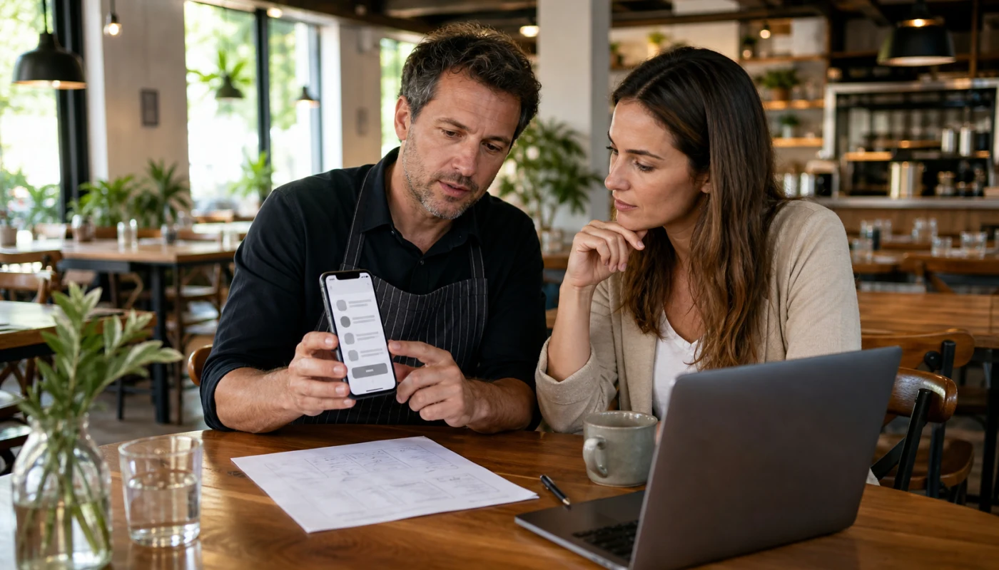
Checklist: seven fixes that improve restaurant ordering page conversion
Use this checklist as the first pass before you spend more on traffic or promotions.
- Test the page on a real phone, not only on desktop.
- Make sure the first screen shows the order action and current hours.
- Remove expired specials, old menu items, and broken links.
- Compress large images so the menu loads fast on mobile data.
- Keep category names plain and easy to scan.
- Place trust details near the order path: phone, address, pickup, and delivery notes.
- Track where guests drop off so the next fix is obvious.
This work connects naturally to restaurant website speed for menu pages and to restaurant web design that turns menu views into orders. The ordering page is where those ideas have to prove themselves.
How page speed, menu clarity, and trust signals work together
Owners sometimes review these issues as separate jobs. Speed is one task. Menu cleanup is another. Local trust is a third. Guests do not experience the business that way. They experience one path, and every weak point stacks onto the next one.
When the ordering page is fast, the menu is current, and the details feel reliable, the restaurant looks easier to buy from. That supports direct orders, but it also supports local SEO and profile performance because visitors stop bouncing so quickly.
If the restaurant depends on Google Business Profile, social media, or repeat local traffic, the ordering page should reinforce that work instead of wasting it.
How Sowynet supports restaurant ordering pages without slowing the team down
We start with the real buyer path. We check where the guest lands, what they see first, and where confusion appears on mobile. Then we tighten the page around the actions that matter most: order, call, directions, and current menu access.
From there, support becomes operational, not vague. The page gets a review rhythm. The restaurant gets a simpler update process. The next fixes become easier to prioritize because the team can see where orders are leaking.
That is why this topic belongs with website support, SEO services, and practical restaurant site upkeep like restaurant website support for menus, hours, and offers.
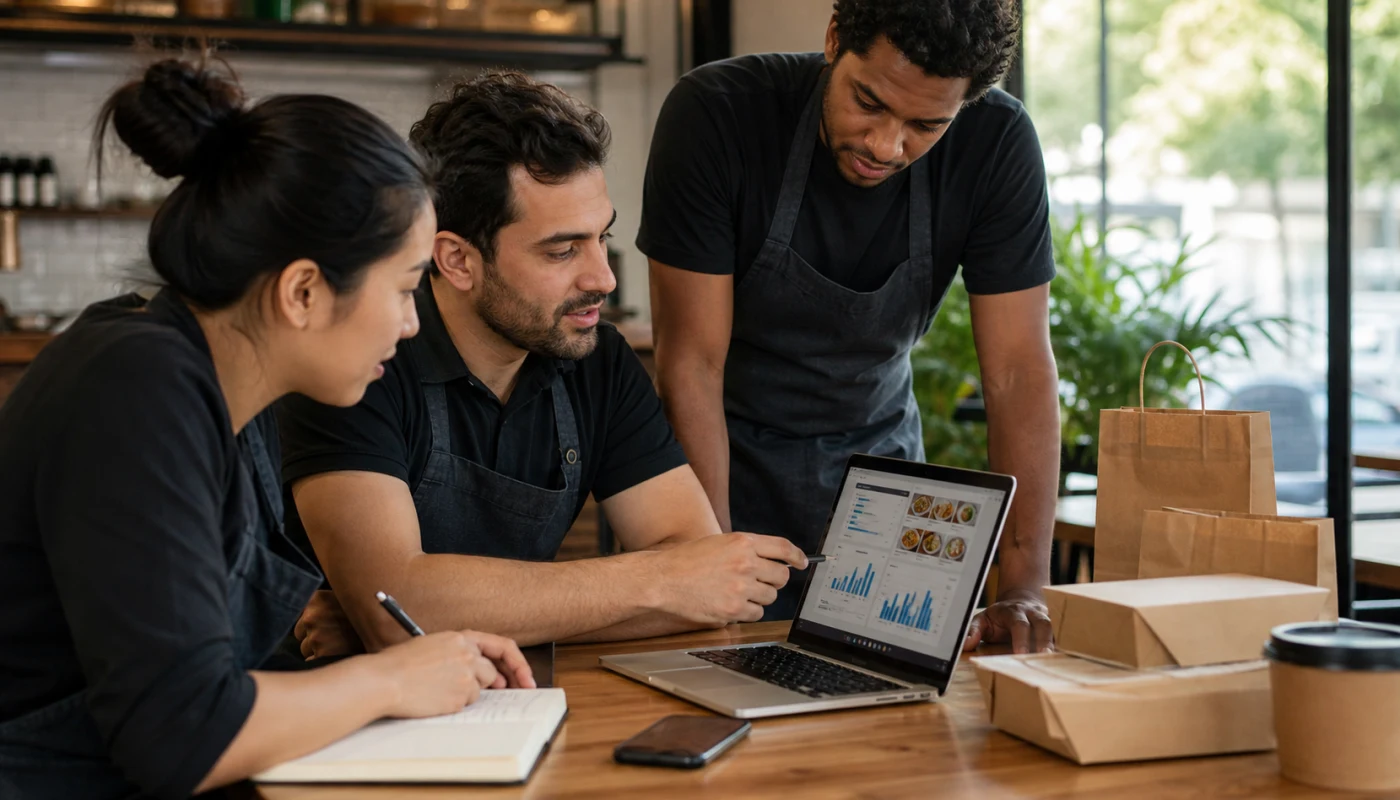
Common mistakes that keep the page weak
The first mistake is sending guests to a generic homepage when they are already ready to order. The second is letting the ordering page drift out of sync with real hours, menu updates, or current offers. The third is adding too many heavy visuals and too many choices before the guest sees the core action.
Another common issue is unclear ownership. If no one reviews the page each week, small errors pile up. Those errors become lost orders, repeated phone questions, and weaker return from every other marketing channel.
What to review every month on a restaurant online ordering page
A simple monthly review keeps the page useful and keeps the team honest about what changed.
- Review the top mobile path from profile, social, and direct traffic.
- Check page speed, menu accuracy, and order-link health.
- Remove one friction point that caused confused calls or slow checkout.
- Update one trust detail: hours, pickup notes, delivery area, or payment expectations.
- Compare page visits with real orders so the next fix stays grounded.
That kind of review is what turns a one-time fix into a better operating system for direct orders.
Internal linking plan
Support the next step with the right pages
Readers should not have to guess what to do next. This topic works best when it connects to the service page that owns upkeep, the SEO page that supports visibility, and the related restaurant guides that improve conversion.
Clear next step
Need help improving a restaurant online ordering page?
We can review the current page, show what is slowing guests down, and map the shortest path to cleaner ordering conversion.
Book an ordering page reviewFrequently asked questions
Questions owners ask before they fix this
What should be on a restaurant online ordering page first?
Start with the order action, current hours, core menu access, and a clear pickup or delivery choice. Guests should not scroll through branding before they can act.
Can a better ordering page help local SEO too?
Yes. A faster page with clearer intent and lower bounce supports the rest of the local search system, especially when Google or social traffic lands there first.
How often should a restaurant review its ordering page?
Review it every week, and again when hours, delivery settings, menu items, or ordering tools change.
What is the most common mistake on restaurant ordering pages?
The most common mistake is adding friction right before the sale: slow loads, hidden order buttons, outdated menu details, or a homepage detour that wastes intent.
Quick summary
Short version for busy teams
Pain: hungry guests reach the ordering page, but small delays and unclear choices stop them before checkout. Fix: simplify the mobile path, keep the order action visible, and review the page every week. Result: more direct orders from the same menu traffic.
Loading related resources...
Loading recent posts...